Last week, M&C's in-house LGBTQ+ Network Group held its autumn meeting to celebrate #TransAwarenessWeek.
As well as an exploration of the #trans statistics revealed by the 2021 census, participants enjoyed an informative quiz, and received an update from members of M&C's #EDI Committee.
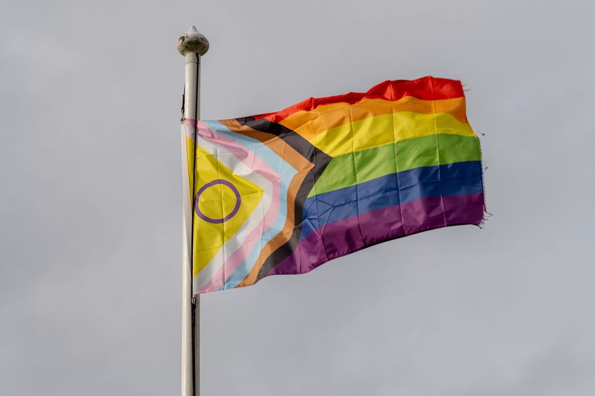
Of particular interest was a discussion of the meaning of the new Pride Progress flag, which includes a chevron on the left, including stripes of pink, baby blue and white to represent the transgender flag, black and brown stripes representing LGBTQ people of color, and a yellow triangle and purple circle representing the Intersex community; yellow and purple were chosen as colours free from association with any particular gender, while the circle symbolizes the wholeness and completeness of intersex people.
The chevron itself is designed to reference the progress still needed to reach equality for all.
The original Pride flag was designed in the 1970s and used eight colors: pink for sexuality, red for life, orange for healing, yellow for the sun, green for nature, turquoise for art, indigo for harmony, and violet for spirit. Pink was eventually removed because fabric in that color was difficult to source, and the design was simplified to create the six colours we are familiar with today.
It was great to see so many M&C people on the call, and to have the opportunity to ask questions and address common misconceptions.
We look forward to our next meeting, which will take place in the spring.


/Passle/6130aaa9400fb30e400b709a/SearchServiceImages/2026-04-09-14-16-49-395-69d7b4d18614c88cffdc5368.jpg)
/Passle/6130aaa9400fb30e400b709a/SearchServiceImages/2026-04-09-12-38-49-770-69d79dd92952f1d4f47109a1.jpg)
/Passle/6130aaa9400fb30e400b709a/MediaLibrary/Images/2026-04-07-13-45-21-168-69d50a71e50d418cb2c70c65.png)